Architecture for a Brutal World, Part I
by clé tile | published: Mar 15, 2024

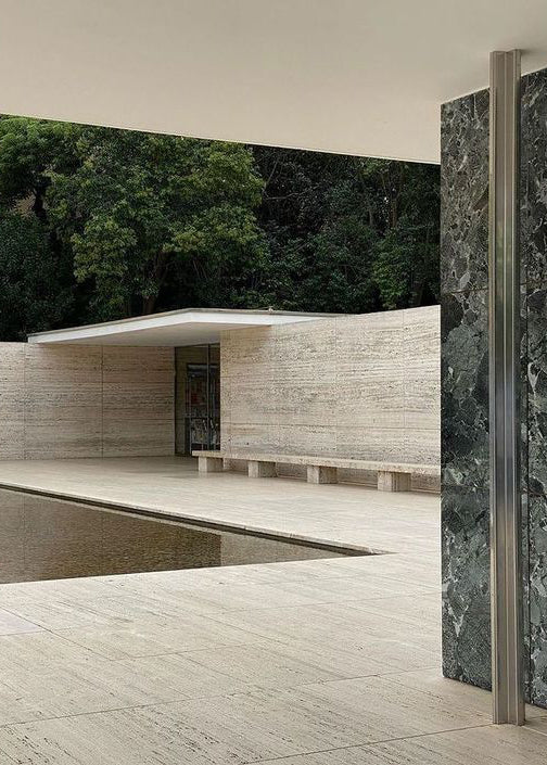
the barcelona pavilion designed by ludwig Mies van der Rohe — image courtesy of Filip Pižl
if there is one style of architecture that provokes the most reaction (other than McMansions), it’s Brutalism. Some people love it, others hate it — rarely is there ever indifference. What is it about Brutalism that conjures such passion? And what exactly constitutes this style? Unpacking Brutalism’s multiple layers reveals a complex history. Turns out, there’s a lot more to Brutalism than just raw concrete.
Born in a Brutal World
Brutalism was born in the aftermath of World War II. With much of Europe laid in ruins, governments needed a way to reconstruct — and fast. Add to this a growing weariness of the architectural styles of the previous decades, as well as continued shortages of building materials, and the time was ripe for a new type of architecture to emerge.

the barcelona pavilion designed by ludwig Mies van der Rohe — image courtesy of Andreas Sohns

House in Abiko Japan design by Shigeru Fuse
This style came in the form of visible construction. Though Brutalism (or New Brutalism as it was sometimes called) blossomed in Britain, its roots were first tapped in Sweden when architect Hans Asplung coined the term nybrutalism (Swedish for “neo-brutalism”) in 1950. But it wasn’t until 1955 when architectural critic Reyner Banham wrote about “The New Brutalism'' that the movement really took off. Banham associated the name with the béton brut (“raw concrete") of Le Corbusier and the art brut (“raw art”) described by French artist Jean Debuffet — rawness being the key term to describe the unpolished approach to materials and construction that Brutalism exposed.

National Assembly Building in Dhaka, Bangladesh, designed by Louis Kahn — image courtesy of Raymond Meier
Brutalism was the perfect remedy to the brutality of the War. Its low-cost, utilitarian nature allowed Europe to kick-start its reconstruction, especially for the governmental and civic buildings like schools and libraries that had been destroyed by German bombs. Brutalism was also used to build large, affordable residential structures, badly needed to help clear slums and rehouse displaced families and returning soldiers.
Beauty and the Beast
The Brutalism of the mid-century was more than a collection of aesthetic characteristics; it was a design ethos that built on the philosophies espoused by earlier modernist architects like Le Corbusier, Walter Gropius, and Mies van der Rohe. Their beliefs that architecture should be simple, honest, and functional were key tenets shared by both Brutalism and the Bauhaus. It is because of these beliefs that Brutalism is often conflated with the International Style of architecture. But though the two styles shared an ideology they differed in approach. Where International Style was light and airy, Brutalism was heavy and massive. Where International Style was streamlined and sleek, Brutalism rough and crude.
Stylistically, Brutalism is characterized by large, sculptural buildings that celebrate their own massiveness. This visual (and literal) weight was in part created through the ample use of poured concrete. In many ways, Brutalism was geometric genuflection rendered with monumental gray blocks of rectangles, triangles, and cylinders. Though concrete was chosen because it was both cheap and readily available, Brutalist architects also found a kind of beauty in the raw material, highlighting its seam lines, open tie holes, and pocked surfaces. They continued this structural transparency throughout, adding elements like bared brick walls, visible ventilation towers, and exposed steel beams — the more geometrical the better.

Caracas Museum designed by Oscar Niemeyer
Brutally Honest
This honesty of construction was a brash counterpart to the “truth to materials” ethos of the Bauhaus. By exposing a building’s internal structure, Brutalist designers were in part exposing a naked truth: the world was a cold and brutal place. And therein lies the hidden moral message behind Brutalism’s ugliness. Its massiveness was at once both intimidating and optimistic. It spoke to a post-War display of strength, power, and domination during the burgeoning Cold War, as well as hope for a brighter tomorrow through technological innovation and democratic ideals. While concrete was not a new material, its structural possibilities were just being discovered. Brutalist architects found they could layer its large components to add visual texture as well as create the illusion of security through an imposing, impenetrable fortress.
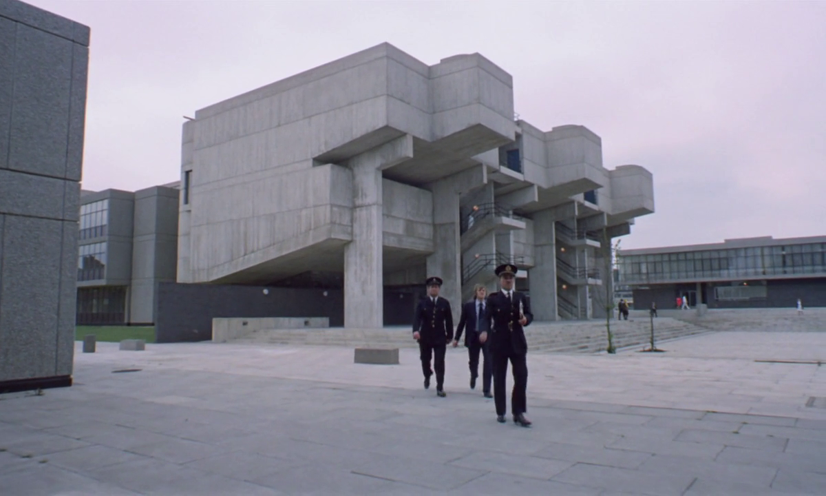
In addition to brutal honesty, Brutalism also spoke truth to power in its promotion of social democracy. Blossoming as a remedy to the post-War housing crisis, Brutalism became the poster child of rebuilding for the common good, foundations that lay in the concepts of functionality and affordability. This was all well and good in theory, but it did not take long before Brutalism’s cold, drab exterior became a visual shorthand for Socialist and Totalitarian regimes. In 1971, Stanley Kubrick used Brutalist structures to represent the dystopia of his futuristic film A Clockwork Orange. The following decade, Michael Radform made similar use of Brutalism’s gray, angular surfaces to represent the institutionalism of George Orwell’s 1984.

film still from A Clockwork Orange, dir. stanley kubrick
Not that the movement had ever won much public approval. As it gained momentum, so did the arguments against it. Brutalism was favored by critics, architects, government bodies… and practically no one else. People argued that its stark appearance lacked warmth and humanity. Despite its moralistic message, the architecture was deemed too "brutal" for its own inhabitants. In the words of architecture writer Nancy Mitchell, Brutalism “seemed designed only to express, not to please. It was fuck-you modernism.”

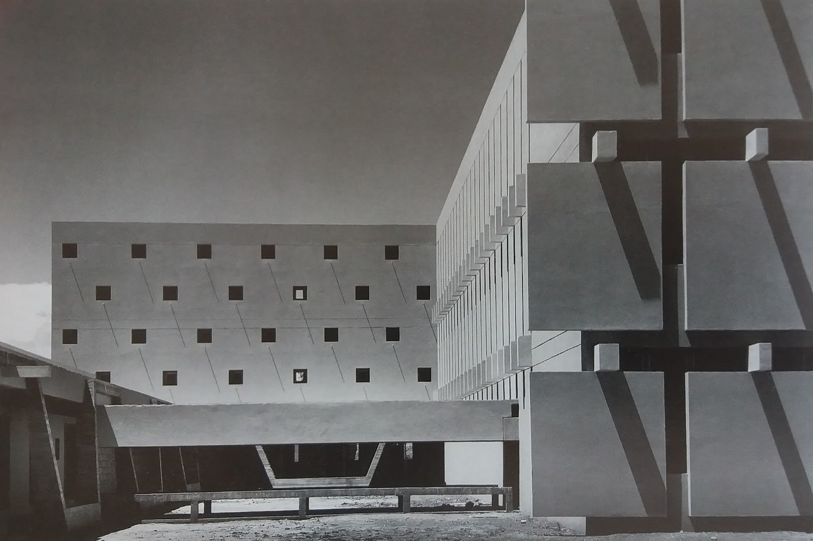
building in the Tsujiki District, Tokyo designed by Kenzo Tange, 1963

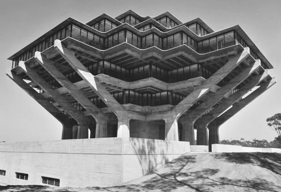
the library at UC San Diego designed by William Pereira — image courtesy of ucsd
color studies + tile
Color studies are crucial for interiors where lighting can change throughout the day. materials, texture, and finish can all play a part in how a color “reads” in a room. tile is especially complicated for this very reason. variegation and variation can soften the intensity of a color — but also magnify the differences between adjacent colors.
but fear not, we’ve got you covered! we believe that redesigning your space shouldn’t be arduous. successful color pairings shouldn’t feel like a code to be deciphered, but an opportunity to tap into emotions and tell your story. you can’t do this by following trends. instead you need to find the story that you want to tell.
But time was Brutalism’s worst critic. Its raw concrete, originally a fast solution to clear slums, became synonymous with urban decay as it cracked, leaked, and fell into disrepair. By the 1980s, even its proponents had had enough. Brutalism, like the concrete it was made of, crumbled.
This might have been the end of Brutalism’s story, but like all great design, everything old eventually becomes new again. In 2015, preservationists began petitioning to save some of the movement’s most important landmarks. To learn how the style has changed, read more in Part II.
-Julie Muniz
