Architecture for a Brutal World, Part II
by clé tile | published: Mar 20, 2024
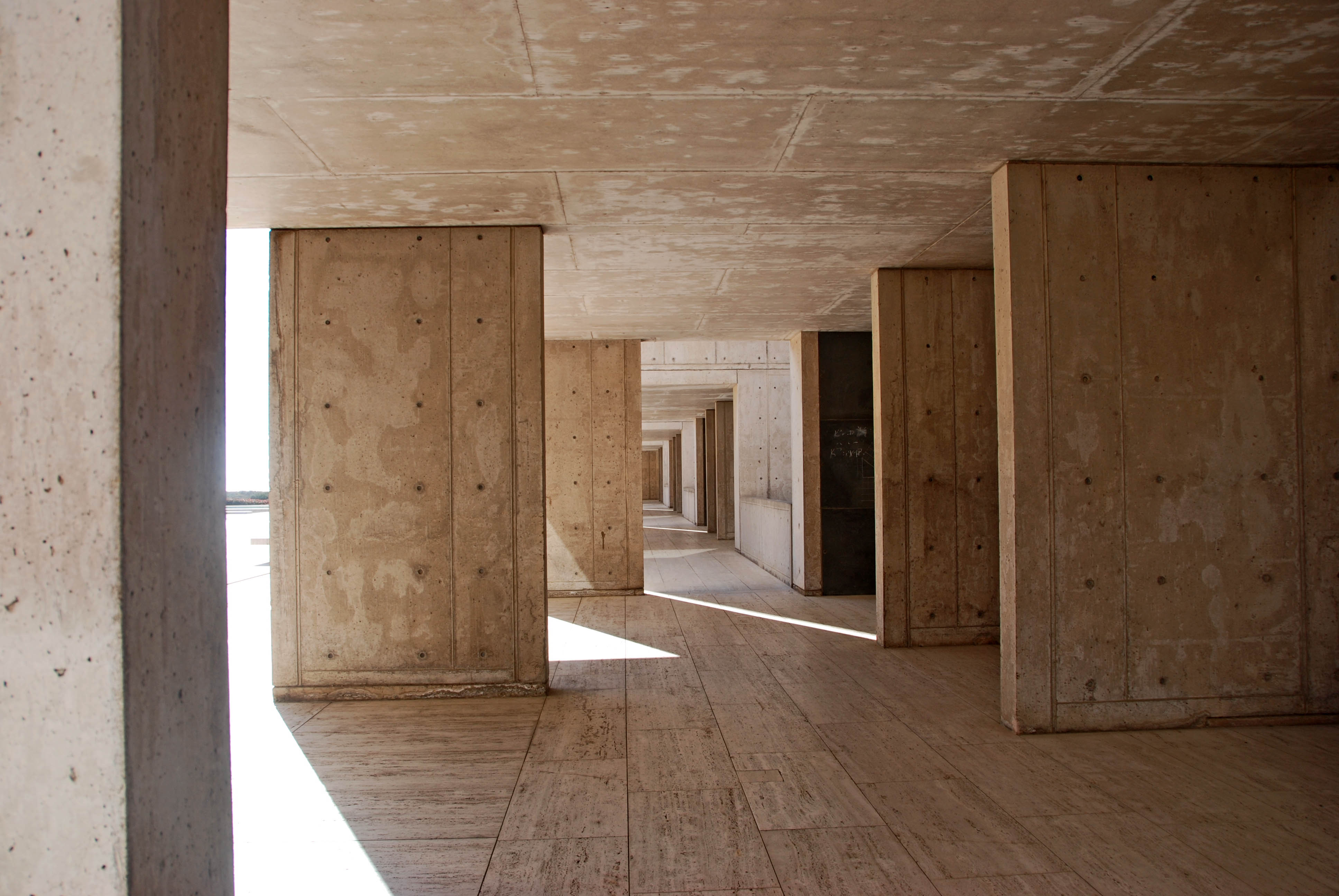
The Salk Institute for Biological Studies in La Jolla, California, designed by louis khan — image courtesy of Virginia duran
love it or hate it, there’s no denying that Brutalism has seen a resurgence over the past decade. What began as preservation campaigns in 2015 has since grown into a brash revival seeping into everything from architecture and décor to fashion and graphic design. With Brutalism back in the public eye, many designers are finding new inspiration — and new beauty — in this rough and ready style.
The Softer Side of Béton Brut
Apart from visual similarities, today’s Brutalism is nothing like the movement Reyner Banham lauded in 1955. The ideology of the past has been largely forgotten, replaced by a general aesthetic of unfinished textures and oversized elements. Designers may pick and choose what they liked from the past, discarding the rest. Concrete and black steel? Keep. Moralistic undertones? Ditch. Layered components? Yes, please. Monstrous masses? No thanks.
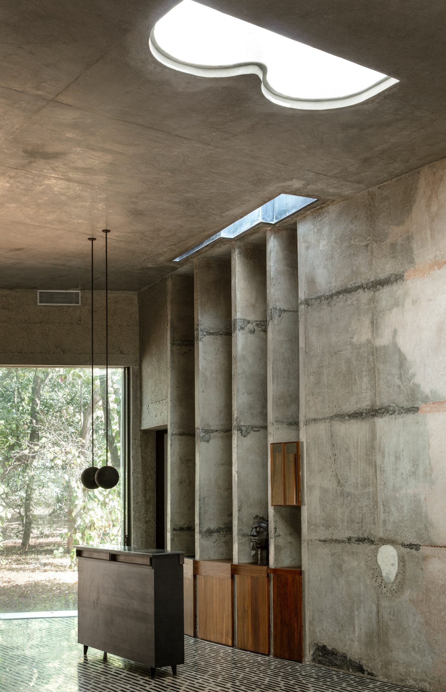

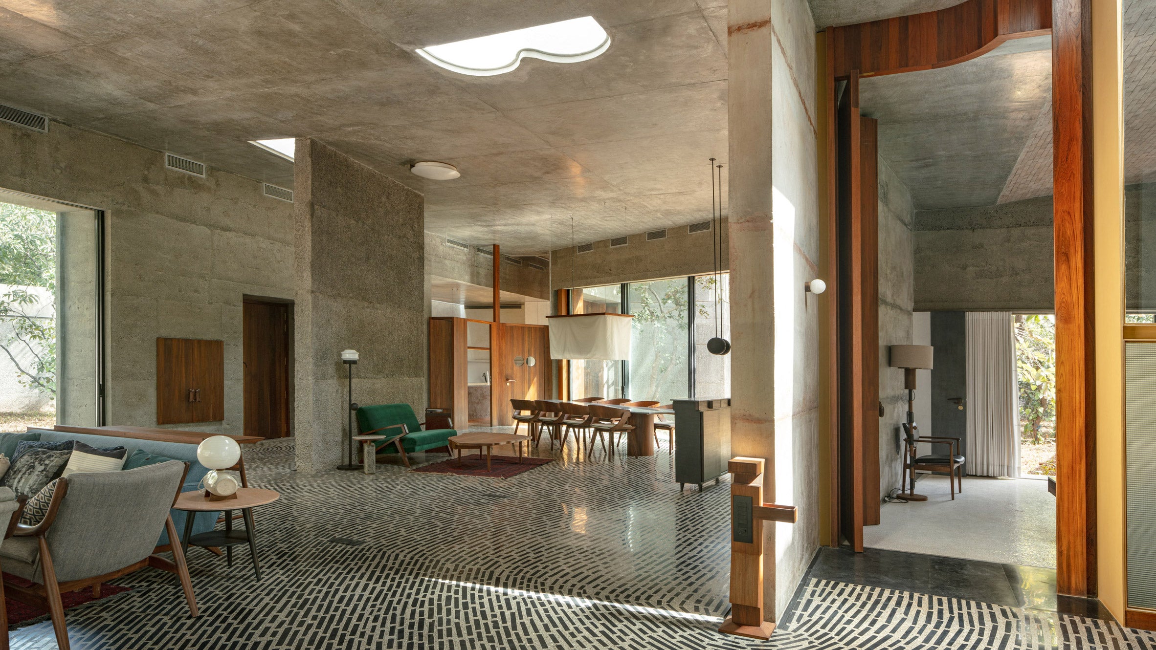
The house of concrete experiments in Alibaug, India, designed by local studio Samira Rathod Design Atelier — photography by Niveditaa gupta
While Brutalism has become an amorphous style in today’s parlance, one element has remained a constant: concrete. But today’s architects and designers seek to soften the béton brut, adding the warmth and humanity that the earlier buildings lacked. Biophilic elements like wood, stone, flora, and even water, help blend the architecture into the landscape, creating spaces that feel safe and protected rather than cold and imposing. Though some have attempted to rename these iterations as new styles (Eco Brutalism and Lyrical Brutalism, for example), they all reimagine Brutalism through 21st century values. So much so that what is called Brutalism today is sometimes also described as Industrial Modern or Industrial Style.
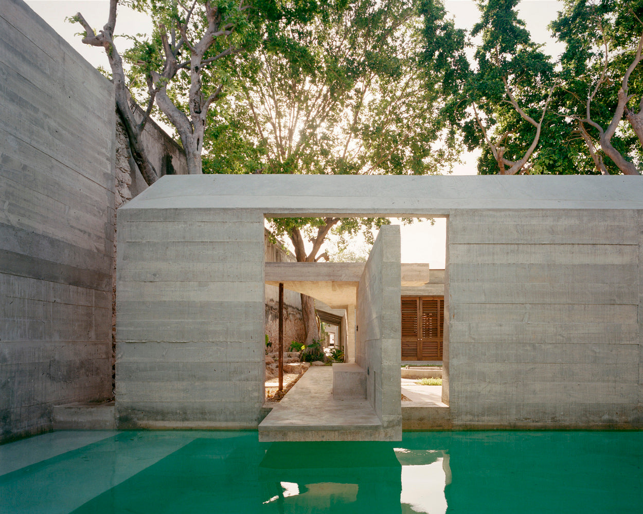
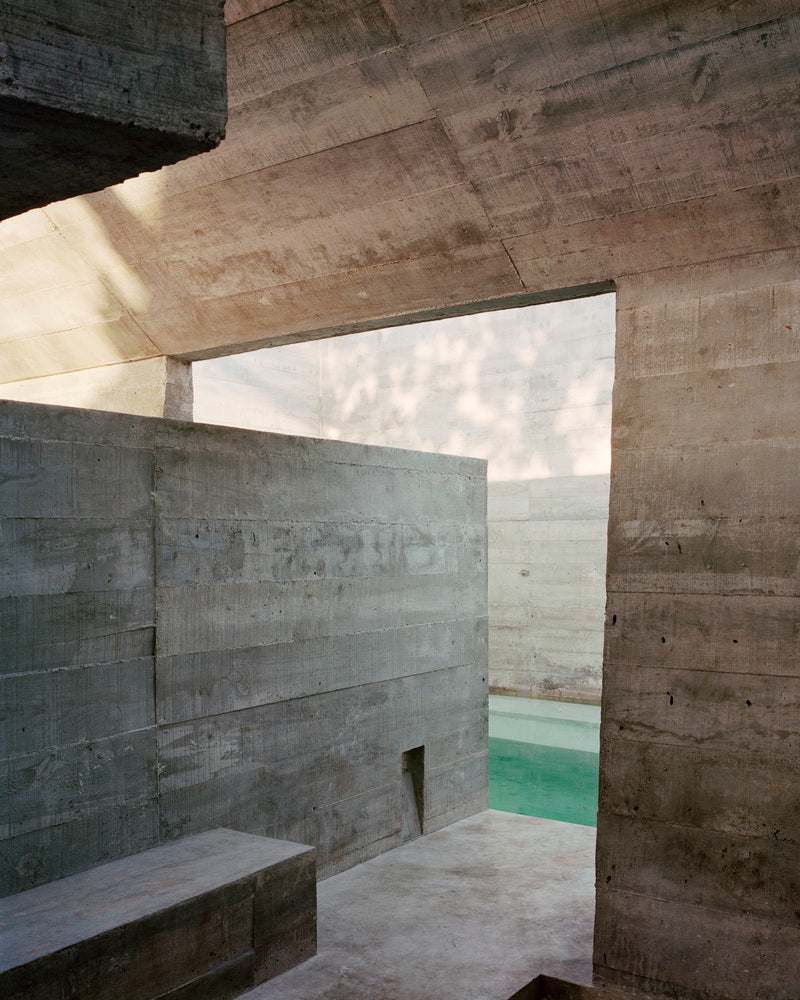
The merida house, in merida, mexico, designed by Ludwig Godefroy Architecture — photography by rory gardiner
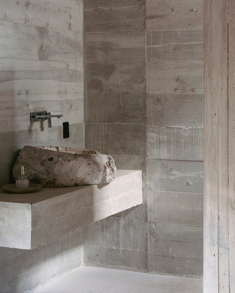
In this softer interpretation of the new New Brutalism, glass and light become key elements. Their addition brings an open, transparent quality to these structures, allowing natural light to penetrate deep into the spaces. It also makes contemporary Brutalism feel more like International Style rendered in gray concrete. Despite these refinements, Brutalism today remains dedicated to design “honesty” through the copious display of construction. Walls and surfaces may be smoother at times, but they are still all too willing to reveal their material elements.
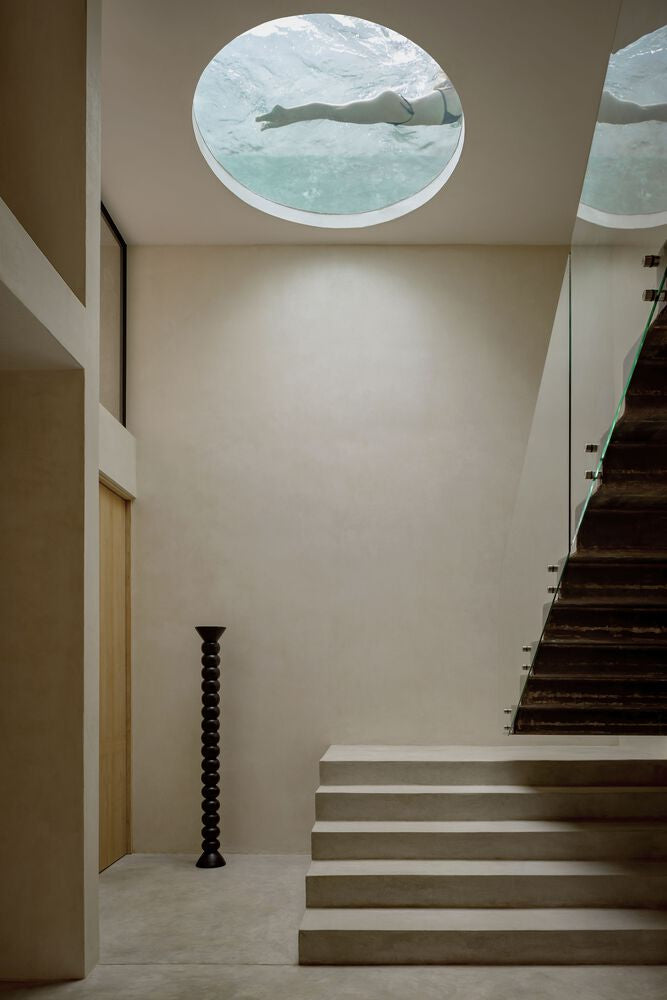
the Villa cava in tulum, mexico. designed by Espacio 18 Arquitectura — images courtesy of arch daily
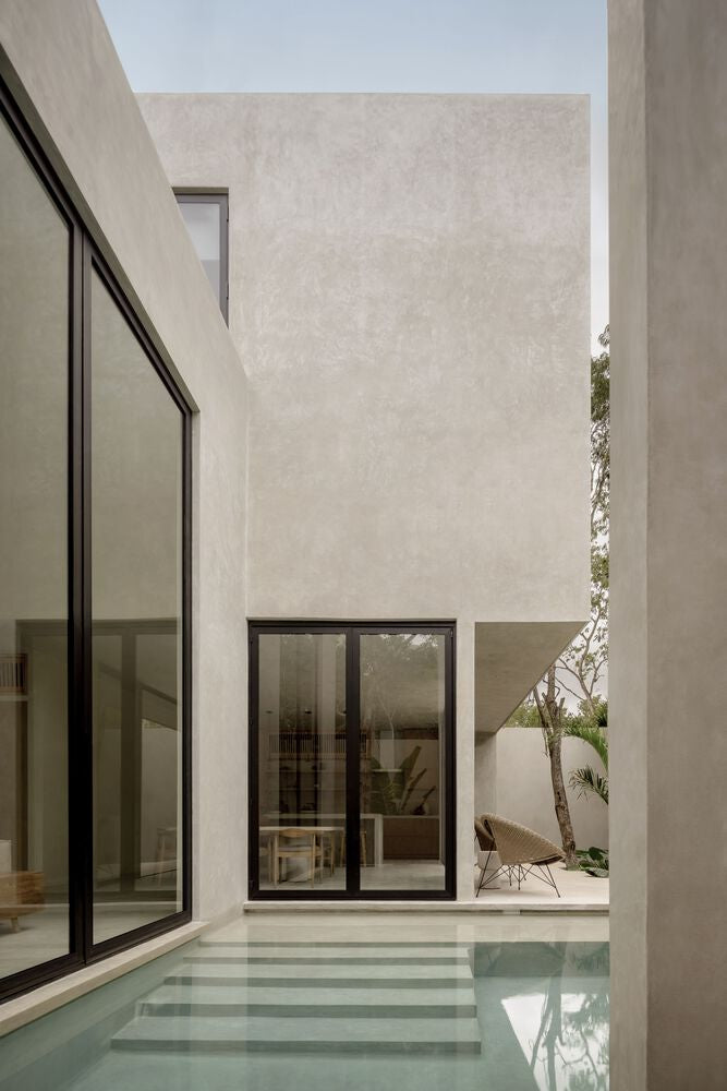

Interiors are not immune to this newly tamed display. Softer features like rough hewn woods, lumpy ceramics, and sculpted edges mollify concrete walls, while lighter color palettes (often accented against black metal and bronze) brighten the space. Plants and textiles are used strategically to add warmth and texture to living areas, ensuring they feel inviting rather than imposing.
The Softer Side of Béton Brut
Like its older sibling, contemporary Brutalism has muscled its way into other creative explorations — even literature. As with architecture, the style has largely lost its past meaning, leaving behind aesthetic elements that can vary between industries. Rather than ethical and honest, Brutalist design today feels youthful and rebellious. But traces of the original ethos do remain, particularly Brutalism’s emphasis on efficiency and transparency of construction.
In digital design, for example, this transparency is often by way of a white, blank screen that remains unobscured by color or textural overlays. Instead, designers place emphasis on oversized typography and monochrome layouts punctuated with occasional pops of harsh color. Brutalist digital design is related to Anti-design but does not completely eschew basic design principles like visual hierarchy or color harmony.
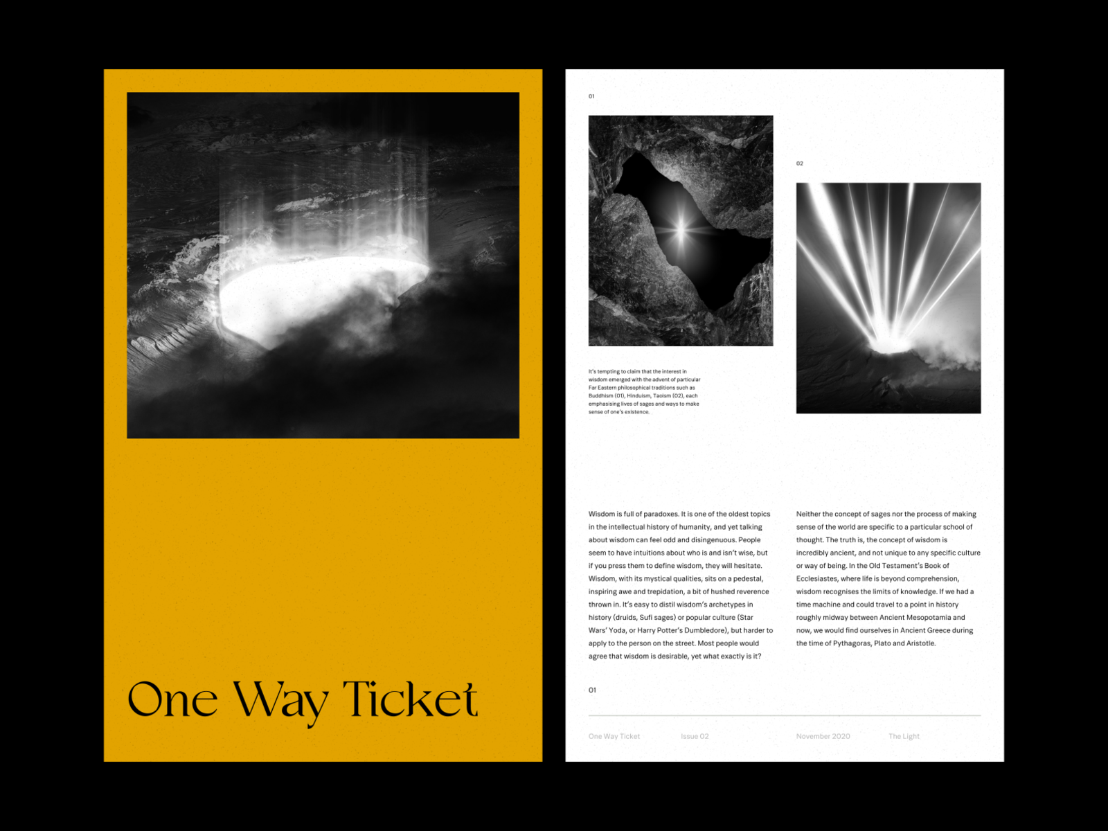
magazine layout by luka marr
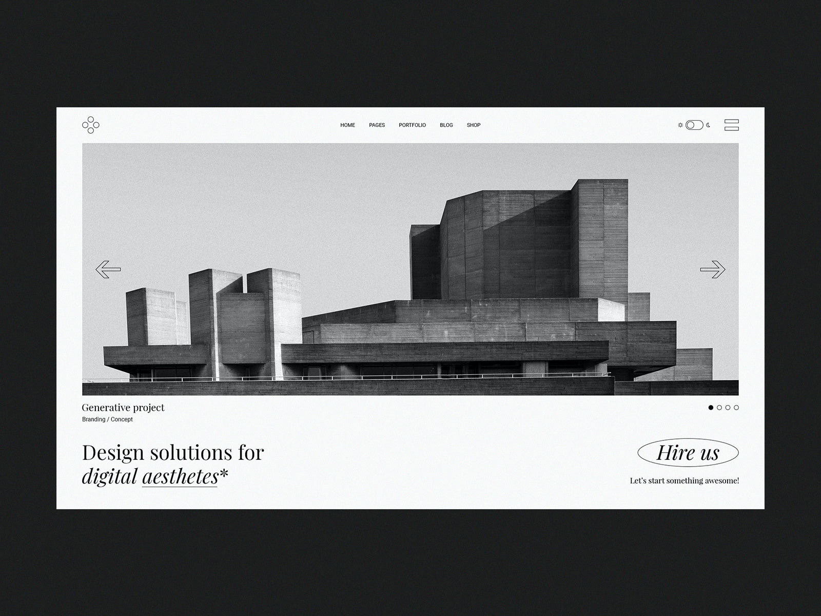
minimalist design portfolio by Aleksandar Igrošanac
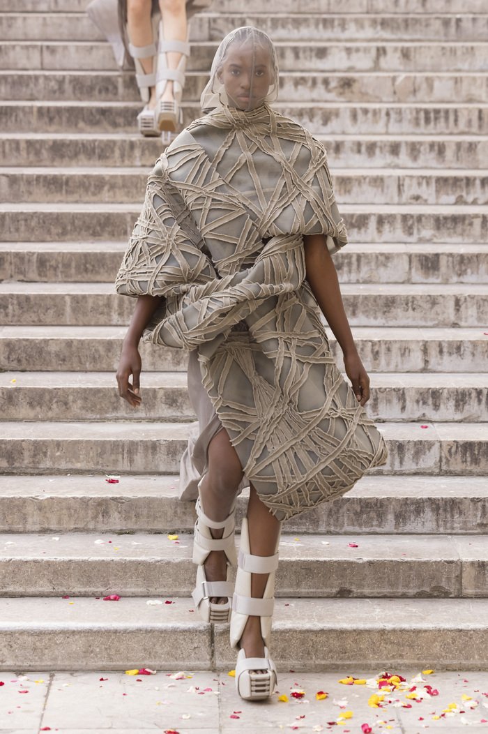
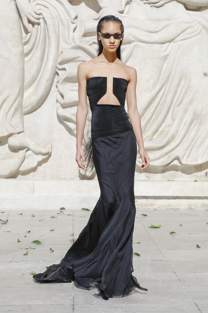
The same is true of Brutalist fashion, which is often characterized as monotone (often black), edgy, and deconstructed. Japanese designers Yohji Yamamoto and Rei Kawakubo are both known for their deconstructed garments that often feature layered and draped elements and asymmetrical silhouettes. American Rick Owens, aka fashion’s “Lord of Darkness,” draws inspiration from the brutish architecture of the past featuring dropped crotches and sleeveless tops that mimic concrete pillars, and oversized jackets that feel like personal fortresses.
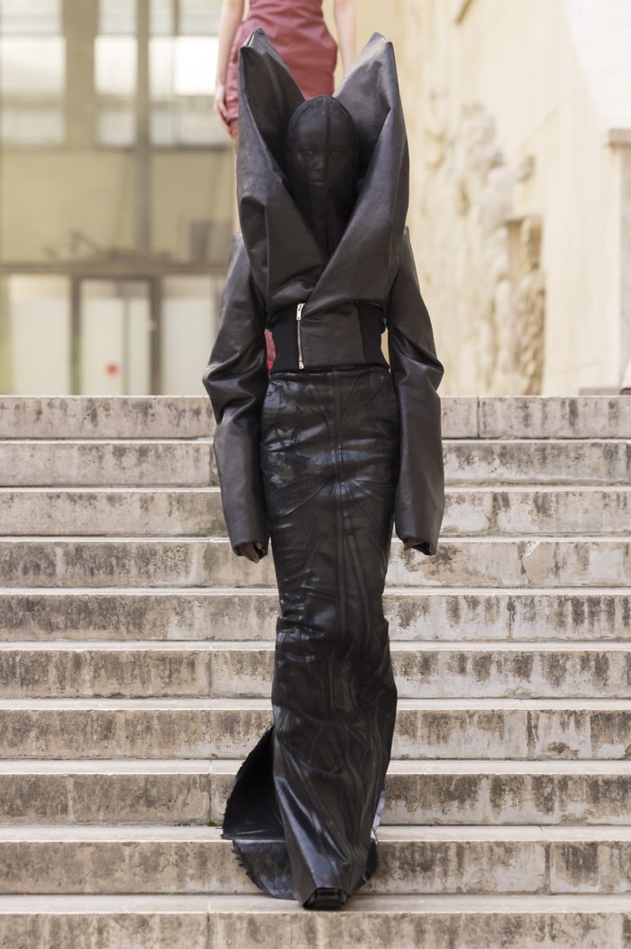
pieces from Rick Owens womens collections : FW23 EDFU, SS24 LIDO, and SS22 fogachine — images courtesy of Rick Owens
color studies + tile
Color studies are crucial for interiors where lighting can change throughout the day. materials, texture, and finish can all play a part in how a color “reads” in a room. tile is especially complicated for this very reason. variegation and variation can soften the intensity of a color — but also magnify the differences between adjacent colors.
but fear not, we’ve got you covered! we believe that redesigning your space shouldn’t be arduous. successful color pairings shouldn’t feel like a code to be deciphered, but an opportunity to tap into emotions and tell your story. you can’t do this by following trends. instead you need to find the story that you want to tell.
Of all the contemporary Brutalist iterations, furniture is most aligned to the movement’s original use of raw materials to create massive and imposing work. Owens, who also creates furniture in addition to clothing, often features mixed, incongruous materials like stone and fur to create a feeling of discomfort. Other designers use rough hewn words, steel, and other raw materials to recreate the brutal feel of the original architecture. Layered elements are also seen, often composed into geometric patterns. Rather than looking refined, however, these layers create a slap-dash aesthetic that also harkens to the Brutalist monuments of the 20th century.
Today, it seems pretty much anything can be called Brutalist if it has concrete, layered elements, or in some way exudes a sense of raw power. Even the slightest hint of an edgy vibe can earn the title. It’s almost as though Brutalism has come full circle and finally achieved the egalitarian principles it once preached.
-Julie Muniz