clé tile installation feature: anthony d’argenzio
by clé tile | published: Oct 30, 2020

when anthony d’argenzio of zio & sons collaborated with clé on a line of zellige tiles, he was looking to create an updated, modern take on classic old-world patterns, while still honoring the tile’s long heritage. this approach of combining the old with the new was also how he tackled the design of his latest hudson, new york renovation project.
anthony recently revealed his latest bathroom renovation, where he showcased his knack for creating a classic, vintage feel with a mix of both new and repurposed elements.
challenges of working with a blank slate
anthony labeled the 80-square-foot bathroom as a “cookie-cutter” space, where you need to “think outside the box when you’re working in a box.” the renovation required a full gut, taking everything down to the studs.
“a blank slate brings its own challenges, especially if you want to honor the original style of the building. we wanted the bathroom to feel vintage inspired and not like it was created from scratch. i believe that if you use better-quality materials, things will last longer and the integrity of the design won’t be compromised, so i focused on carefully selected finishes,” he shared.
setting the tone with zio & sons + clé
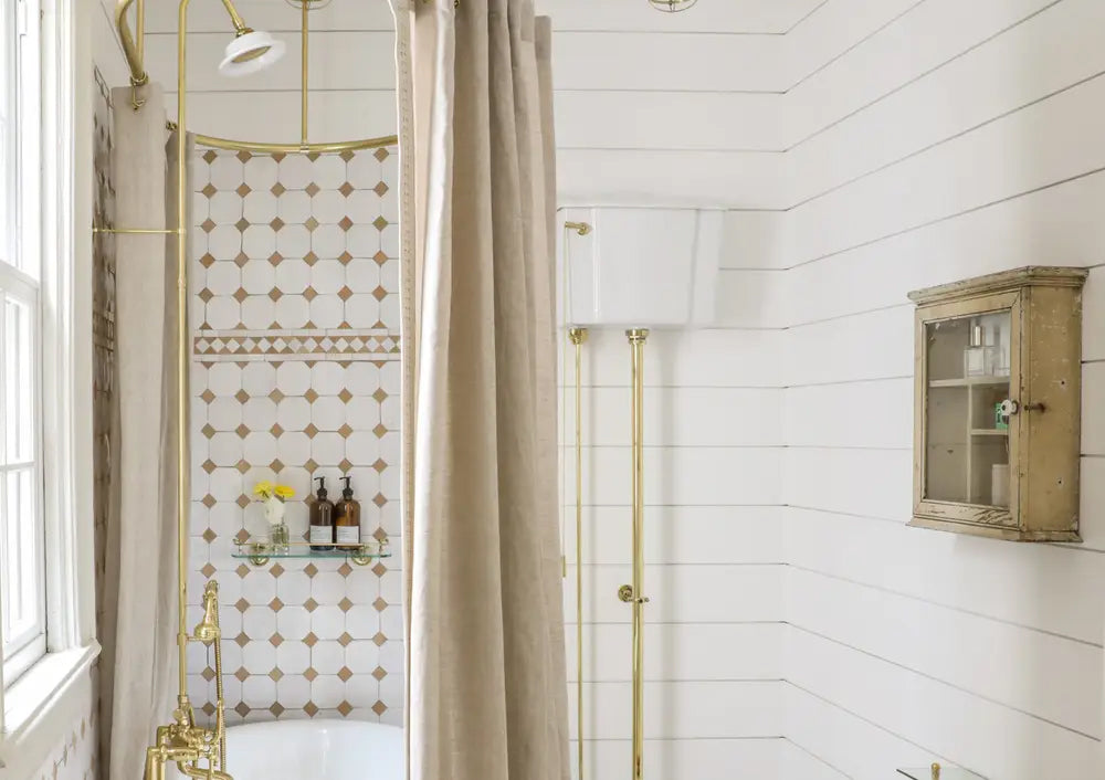
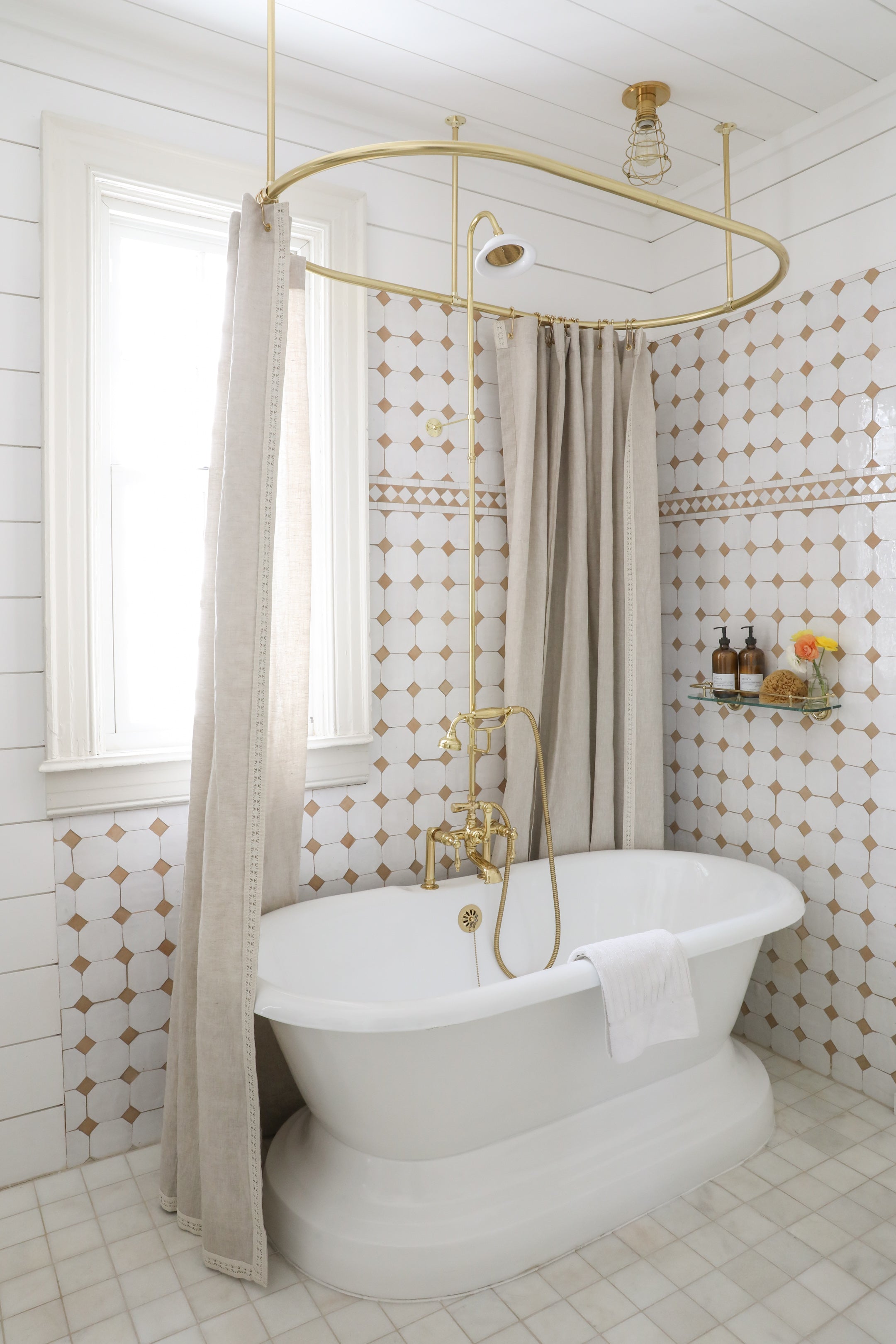
many designers who use clé tile focus on the tile as the central element of the space. anthony remarked that he immediately knew he wanted to use zio & sons + clé tile for the shower walls, ultimately creating the basis for a room with a warm palette of whites and brasses, a touch of natural stone, a creamy-colored grout, and farrow & ball’s school house white paint.
it was also important for anthony to use only honest and natural materials. “there’s no plastic, acrylic, or drywall.”


getting creative with your budget
looking at the finished room, there are so many pieces that emanate quality and authenticity; however, anthony made an astute distinction that “quality” doesn’t necessarily equate to “expensive.”
“quality is possible at all price points, you just have to do some digging. i look everywhere, from antique shops, garage and estate sales to facebook marketplace and even sometimes auctions. you never know where you’re going to score something.”
an experience that resonates with the most imaginative designers is that encounter with an unexpected accessory that sparks inspiration. for anthony, it was a set of six small hooks that caught his eye at a flea market in france, one of which he ended up using for the towel rack next to the bathroom sink.
“hardware is a good place to start with vintage, because you can mix it into any design and it doesn’t take up a lot of space. these hooks are simple, but they’re kind of funky and cool.”
by combining a few antiques, such as a 19th-century mirror and medicine cabinet with modern pieces that give off a classic feel, anthony was able to manifest the vintage charm he’d envisioned. with the placement of a cast iron tub and a freestanding sink, he achieves this vintage yet updated look. “it’s all about finding character in contemporary brands.”

appreciating the timeless tradition of tile
anthony is a great collaborator for clé, as he not only sees all the possibilities that can happen with a tiled surface, but he also appreciates all the imperfections that come with a handcrafted tile and the patina that will come with age. his old world soul pairs well with this timeless material. you can view some additional highlights of anthony’s renovation in this youtube video by domino magazine.