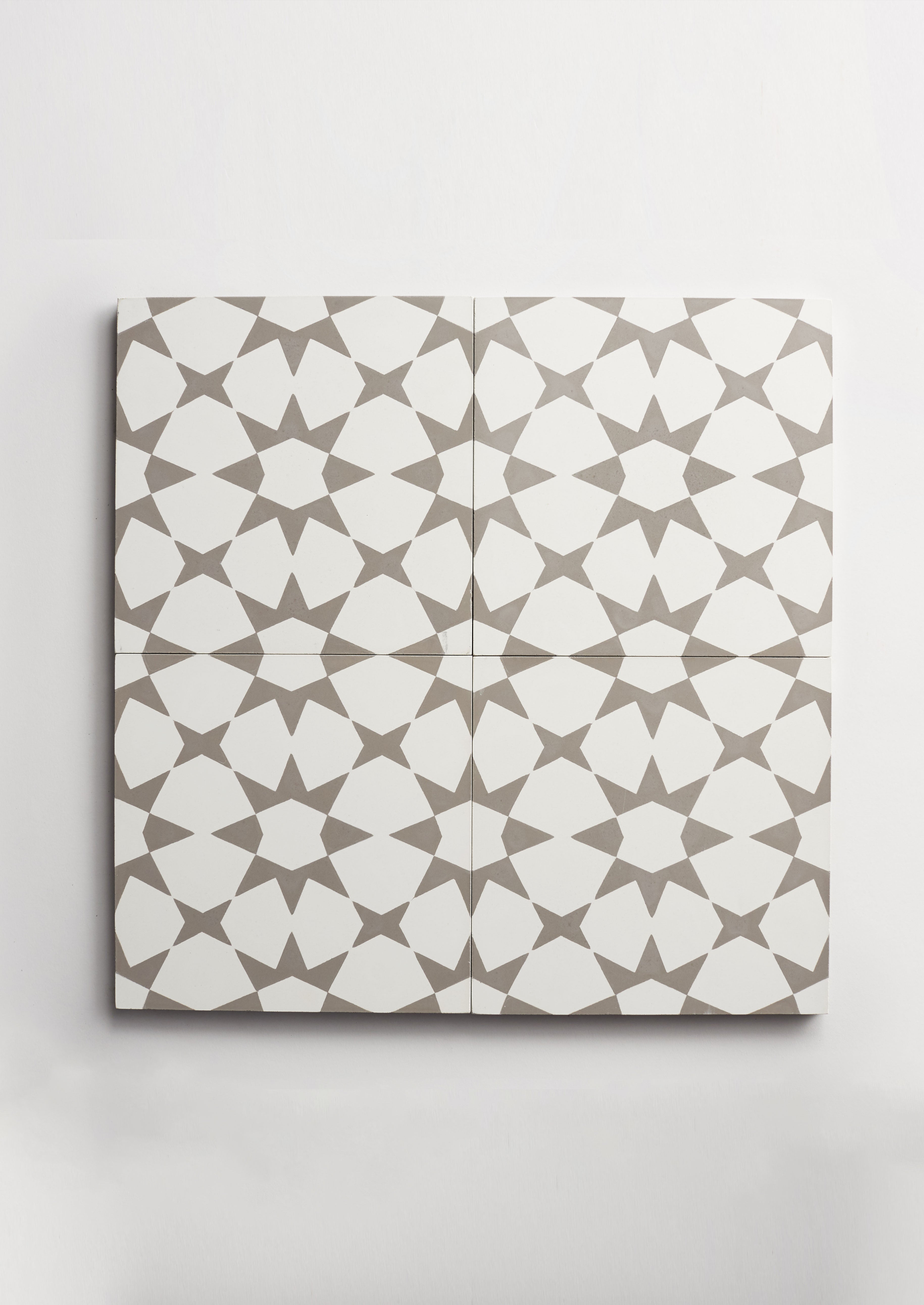
from heritage deco to modern maximalism
by clé tile | published: Jan 14, 2022
we started seeing signs of the newest incarnation of art deco a few years ago: rounded corners on the vladimir kagan sofas popping up in design shows. then, we noticed that velvets and more sumptuous fabrics were overtaking humbler textures. we watched brass and metals trend–along with curved archways. and we saw a resurgence of maximalist pattern while high-contrast colors staged a counter-revolution against mid-century neutrals.
now this trend’s fully embedded everywhere, from pinterest to architectural digest, from west elm to the swankiest design gallery. and we can see why: there’s broad appeal, many directions in which to take design, and a nod to heritage and history.to be clear, we’re not trend-chasers: tile is not disposable, and we always opt for enduring interiors. but in the case of 21st-century art deco, we think it’s a style with staying power–a new classic.
if you’re looking to bring some of this sumptuous style to your design, we suggest that you start with tile. afterall, it sets the tone for everything else for years to come–even the sofa you buy after that curvy velvet sofa.here’s how to introduce just the right dose of art deco into your project whether you’re going for the classic 20th-century…or bringing it fully into the 21st.

radar hex cement tile – design: the darling hotel
embracing heritage deco
are you ready to fully embrace deco, particularly the now-classic 20th-century version? then say it with patterned cement tile and in particular our strong diagonals.
the most iconically “deco” is the radar hexagon in particular in black and white (very jazz age) and, of course, in mocha (a sweet shade verging on pink) and barn. there’s also faceted square, also in the same on-trend colorways.

cement faceted square – design: studio officina / photo: l-ines photo
cement cubicon slant – design: emily moore / photo: hope rollins
other patterns with the classic “deco” vibe include our trompe l’oeil classics such as cubicon slant, diamond twist. while these patterns far pre-date the 20th century’s art deco era, trompe l’oeil was very much a part of deco’s design language, taking cues from mc escher and even the surrealists.

rocaille shells at the pink closet – design: cristina celestino / photo: davide lovatti
for the pattern-phobic, consider rocaille, from the clé-exclusive (in the us) fornace brioni and cristina celestino ceramic tile collection. these sea shells’ rippled concave forms create a charming play of light across your walls, and rocaille’s colors–mint, white, and a soft pink nude–go perfectly with a touch of deco.
shining on
if the aspect of the movement you’re most drawn to is its full-on glamour, there’s just nothing more full-on than our metal collection.

shimmer brings to mind a swank roaring twenties club, with glistening brass pailletes that embrace the opulence and decadence. and if you want to dial things up even further, there’s gold and platinum zellige: handcrafted zellige tile hand-painted with these precious metals. gold is opulent, luxe, and decadent, while platinum (ever so slightly more subtle) suggests the machine age design motif of the original art deco era. these are statement tiles, to be used with restraint–or abandon.

moroccan fez tile – design / photo: jordan shields design

moroccan fez tile
going back to the classics
looking for something that hints at deco, but is a little more timeless? moroccan themes were all the rage during the first era of deco. at clé, it goes far beyond a simple aesthetic: our moroccan collection honors the country that’s been one of the epicenters of the tile tradition through the centuries. our homage to the iconic moroccan tile is updated in cement for a modern edge. from moroccan petite arabesque to moroccan fez, these are the designs that have withstood the vagaries of fashion to become true classics.
our classic cement scallops–which echo the curvy deco shapes–are another option: mix black with white for graphic punch, or keep it more neutral: choose a lighter color and use grout to create the pattern.
just a hint, please
if you want the vibe but not necessarily the full-on look, think color, particularly the strong jewel tones. originally inspired by the fauvists, colors like yellow, deep teals, and vibrant reds add maximalism and boldness–but allow you to express it in multiple ways.

ornace brioni acanti tile – design: claude cartier decoration / photo: guillaume grasset photography
modern maximalism
we think one of the most modern ways to embrace our new favorite style is with our collection of terracotta tile from fornace brioni + cristina celestino. celestino’s designs are rooted in history and incorporate many threads from deco design, from the updated classicism of giulio romano to the dimensional labirinto acanti to the streamlined maximalism of tivoli. what makes it even more modern, however, is the material–terracotta–which gives it an elemental, highly textural, hand-hewn, soulful feel to the designs.
whether you call the trend “deco” or “maximalism” or even “moderne” it’s more than a flash in the pan. set the stage for your design classic with clé.

