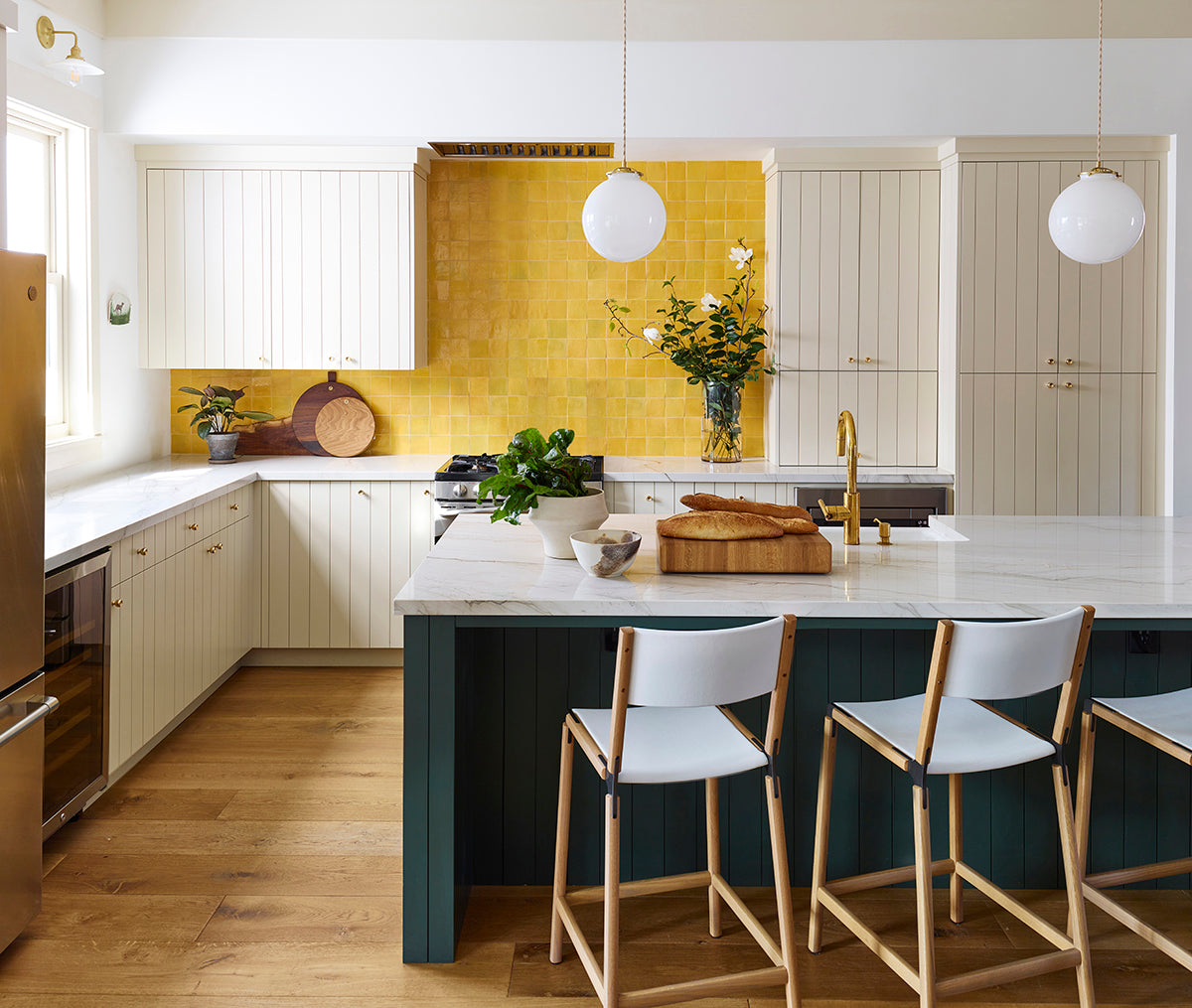
inspiring design: the art of the kitchen backsplash
by clé tile | published: Apr 13, 2022

design: mandy cheng / photo: sarah tramp interiors / cement new west pattern nine
there are few places in the home with as much creative, artistic, and design potential as the kitchen backsplash—and tile is the key to unlocking those possibilities.
if you’re feeling torn between a kitchen vibe that’s trusty and timeless and one that’s more of a color or graphical statement, a tile backsplash is a great place to experiment without feeling like you’re overcommitting.

design / photo: jordan brand / zellige rectangle in weathered white
“backsplash” refers to an area behind the kitchen sink or stove range, but it’s up to you to define where you want your backsplash to start and end. the only requirements are that it should be easy to clean, as well as water and heat resistant.
done right, the backsplash can become a visual anchor, focal point, or theme not just of the kitchen, but for the entire house. in fact, this is why the clé team often recommends starting your kitchen design (or even entire home renovation) with the backsplash—instead of thinking about it as just a functional afterthought.
here are 5 design tips to get you started on your dream kitchen backsplash.
play with shape and space

design: celine ord / eastern earthenware glazed terracotta

design: ore studios / photo: haris kenjar / modern farmhouse brick in cream gloss

design: angeline guido design / photog: matti gresham / cement scallop in federal blue
as we noted, although the term “backsplash” usually refers to an area behind a countertop or stove range, it’s really up to you to define what backsplash means for your project.
at clé, we’re fans—unsurprisingly—of a more maximalist approach, which can provide a more cohesive and design-forward, intentional look. while a small backsplash confined to the area immediately behind the stove is a great place to start, it can make a kitchen feel somewhat visually chopped up, where your tile design element is an afterthought.
follow the europeans and do an entire wall behind the sink or stove, taking tile to the ceiling: it can actually make a small kitchen feel larger, or a large kitchen feel more visually unified.
get in shape with geometric patterns

design / photo: by colossus / cement hex clip in federal blue and white

design: sun soul style interiors / photo: vivian johnson photo / cement slant in black and white
for those who shy away from patterns, remember that you have a little more creative license in the kitchen, and the backsplash is the place to get inspired.
whether your vibe is modern maximalist or abstract and eclectic, cement tiles are a great choice if you’re going for a patterned backsplash. they’re resistant to water and heat, easy to clean, and come in an endless variety of patterns and colors that range from muted to vibrant.
you can also opt for a decidedly geometric layout, as with a herringbone kitchen backsplash.
dial up the glamour with stone and marble
clé’s founder deborah osburn often says that every home needs a touch of stone.
while we often see designers using large slabs, we enjoy the flexibility and visual interest of working with tile, consider clé’s stone collection for a natural stone backsplash, consisting of carrara, thassos, and dolomite tiles in a variety of shapes including planks, squares, and even penny rounds. these still provide a smooth, sleek surface but with less of the heavy veining common in other natural marble. bonus: if you want the look of marble slab at an affordable price, just use larger sizes of our marble tile.

design: michelle zacks designs / photo: vincent dilio / strata planks
if you like the idea of stone, but white marble isn’t your thing, clé strata planks showcase the natural colors that can occur in stone. created from reclaimed stone left over from construction projects, this stone comes in 3 different sized planks so you can experiment with size, as well as color.
go bold with color

design / photo: tropico photo / cement point in federal blue and sky

design: lulu & georgia / zellige rectangle in secret lagoon
your kitchen should be welcoming and inviting, and color plays a big role in establishing the atmosphere of any room (or home, for that matter).
if you already have a color scheme picked out, look for hues that compliment what you’ve already established. (a coastal kitchen backsplash would incorporate soft creams or greens, for example.) alternatively, use the backsplash as an opportunity to make a statement, and choose a color that contrasts against the walls, floors, etc. extra points if you’re mixing patterns as well!
get adventurous with grout options

design: desert wild / photo: swiley interiors / zellige square in riverbed

design / photo: zio & sons / zellige square in weathered white
when designing a kitchen backsplash, the main focus tends to be on the tiles themselves. however, grout is equally important and can provide a strong design element.
a darker, contrasting grout maximizes the effect of a shimmering white tile, and the geometric pattern created by the grout lines adds visual interest, especially when contrasted with the swirling grain of natural stone or marble. grout line thickness is another thing to experiment with: use grout to create a wider space between tiles, or even to create patterns, or separate rows or columns. read more about designing with grout here.

design: lynn k. leonidas / photography: brad knipstein / zellige square in indian saffron
while the endless possibilities of the kitchen backsplash may seem daunting, it’s all about getting creative and letting your personality shine through. the backsplash should be the centerpiece of the kitchen.
it might even be the design highlight of your home as well.

