whiteworks: how to elevate white tile with a bold installation pattern
by clé tile | published: Jun 11, 2021

eastern elements rice paper 4x4, design: sarah sherman samuel / photo: stoffer photography interiors
At clé, our passion for white tile knows no bounds, ranging from the functional to the fantastical and everything in between. in previous posts, we’ve introduced our unparalleled collection of white tile, a curation we’ve dubbed whiteworks, looked at the fine points of ceramic, terracotta, cement, stone, marble, and more, and explored the many factors influencing the decision of which kind of tile to use.
as you hone in on the white tile you want for your space, it’s important to consider one last factor: installation. how you lay your tile can make even the most basic material sing, creating a unique and custom look you’ll love for a long, long time.
use this pattern primer to find the combination of material, shape, size and layout that works for you.
pattern play

any rectangular tile, from ceramic subway tile to modern farmhouse brick to cement, carrara marble, or zellige, can be laid horizontally or vertically in classic offset rows (“running bond” in trade parlance). but line them up in stacks, instead, and the aesthetic becomes more modern. elongated silhouettes change the look yet again, whether staggered, stacked or zigzagged across the wall in a herringbone pattern. you can even combine patterns, create borders and add pops of color to create a design all your own. white tile lends itself beautifully to complex patterns without ever seeming busy.
as we strongly recommend with any installation, before anything else, make sure to take all the tile from the boxes and lay it out as you want it. trust us, it's a step you don't want to skip.

clé guild fundamentals brick in matte white, design/photo: sarah a. intelligator, esq.
envision tile in unexpected places
in America, the historical tendency is to use tile sparingly and in the most utilitarian ways, for kitchen backsplashes and bathroom walls, fireplaces and mudroom floors. in other parts of the world, tile is, quite literally, everywhere: cladding building facades, lining pools, fountains and baths, covering ceilings, dancing up stairs and stretching across bedroom floors straight out to balconies.

weathered white 2×2 zellige, design: studio surface / photo: jenni corti
so as you consider tile for your space, feel free to envision it in unexpected places. take a look at clé’s instagram or in our lookbooks and you’ll find white tile on bedroom and dining room walls, on backsplashes and fireplace surrounds that reach all the way to the ceiling, behind open shelving, on shelves, wrapping niches and even backing glass-doored cabinets. the only limit to where you can place tile in your home is your own imagination.
the power of tile grout

modern farmhouse brick in matte white, design: form + field / photo: seth smoot
lastly, never underestimate the impact of grout. that humble material that holds your tile installation in place can be a design element in its own right, depending on the spacing and color you choose.
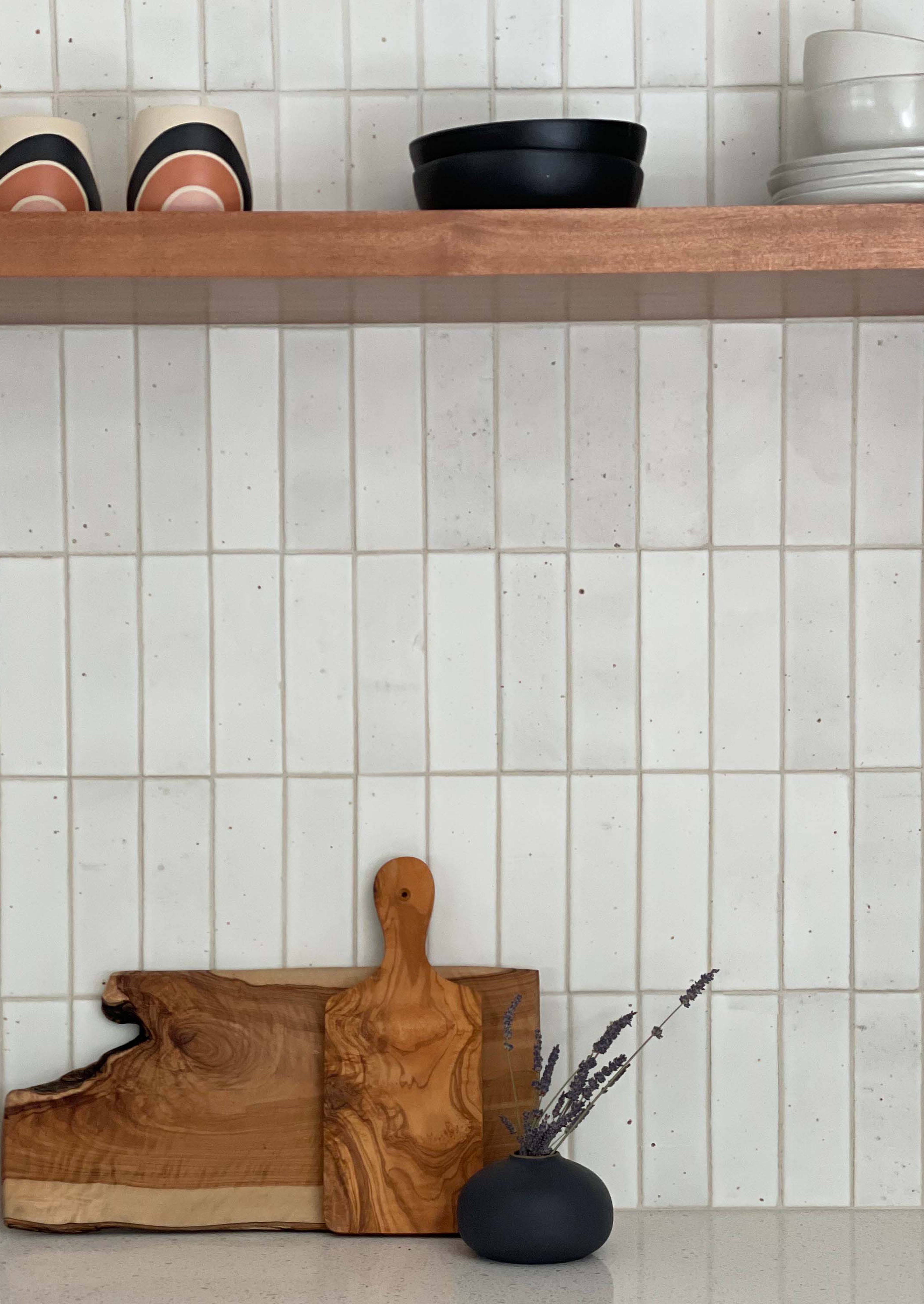
spacing can change the look of an installation dramatically. while conventional wisdom calls for grout lines of uniform width across an entire installation, there are exceptions. zellige, for instance, is traditionally set tightly, with little to no grout at all between tiles. and among the most compelling (and coveted and copied) installations we’ve recently seen was this bathroom by designer sarah sherman samuel in which clé’s modern farmhouse brick was installed with a 1/8-inch vertical grout line between tiles and an oversized one-inch line horizontally between rows. simple. unexpected.

modern farmhouse brick in matte white, design: sarah sherman samuel / photo: stoffer photography interiors
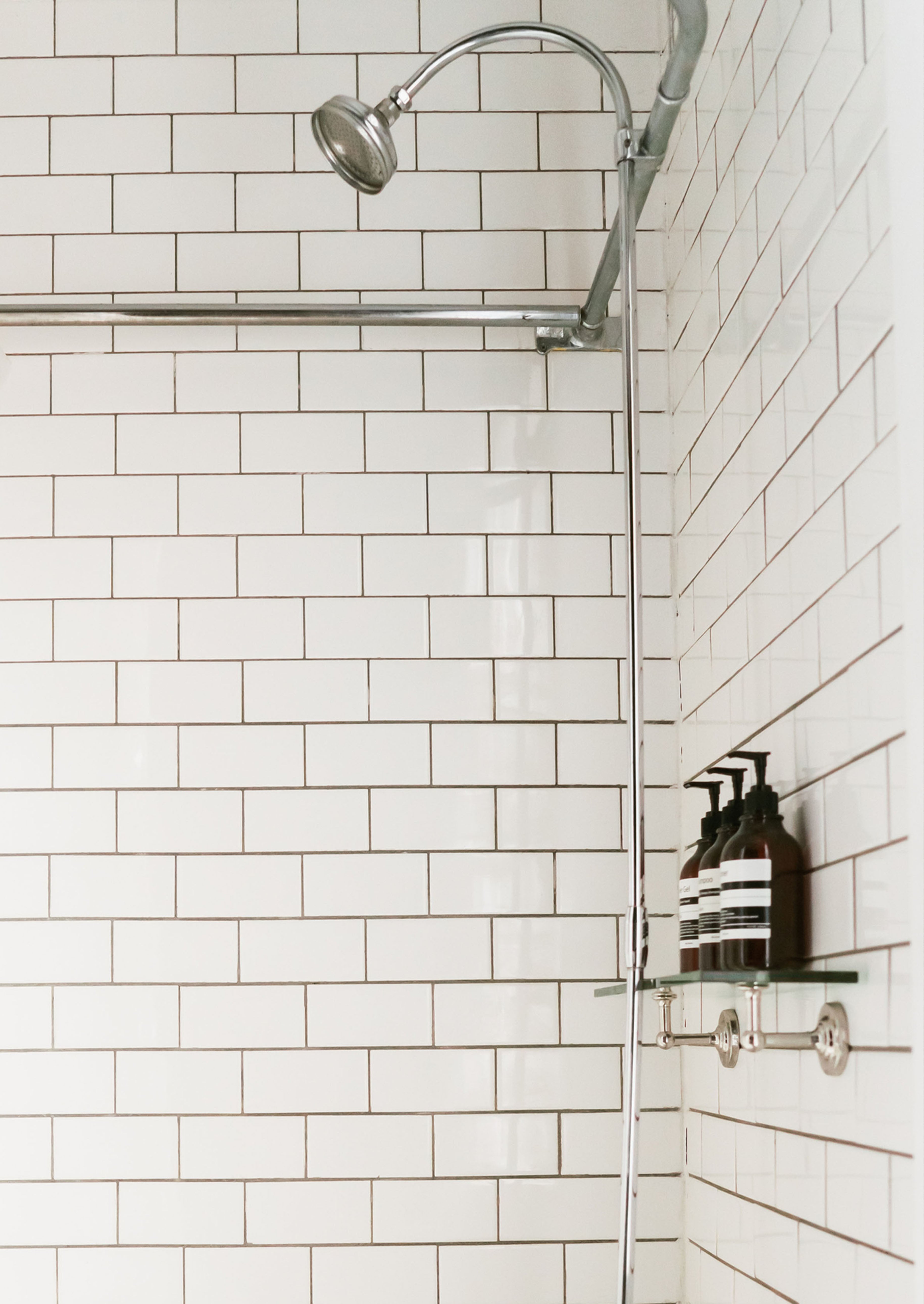
pairing white tile with white or light-colored grout lets the tile take the spotlight and creates a serene sense of uniformity. using darker grout can bring out undertones and hints of color in the tile or emphasize an interesting pattern, creating a livelier, more energized look.
to help you decide which direction works for your project, take a look at some of our favorite combinations here. and because grout, like tile itself, can look different from room to room and in different light, we recommend you have your contractor mock up sample boards with your tile and a variety of grout colors for you to place in the space you’re tiling.
we got you
feeling overwhelmed by the possibilities? for more tips and resources, consult our material guidelines and general grout recommendations.


