deborah osburn on the one thing every home needs
an interview with jenni kayne’s rip and tan
by clé tile | published: Jul 13, 2022

photography: michael clifford photography
count us among the legions of fans of the quintessentially california style of fashion-turned-interiors-and-lifestyle designer jenni kayne: a celebration of texture and neutrals that create a warm, laid-back, but sophisticated vibe.
it’s a perfect vibe for clé, of course.
clé tile at jk ranch
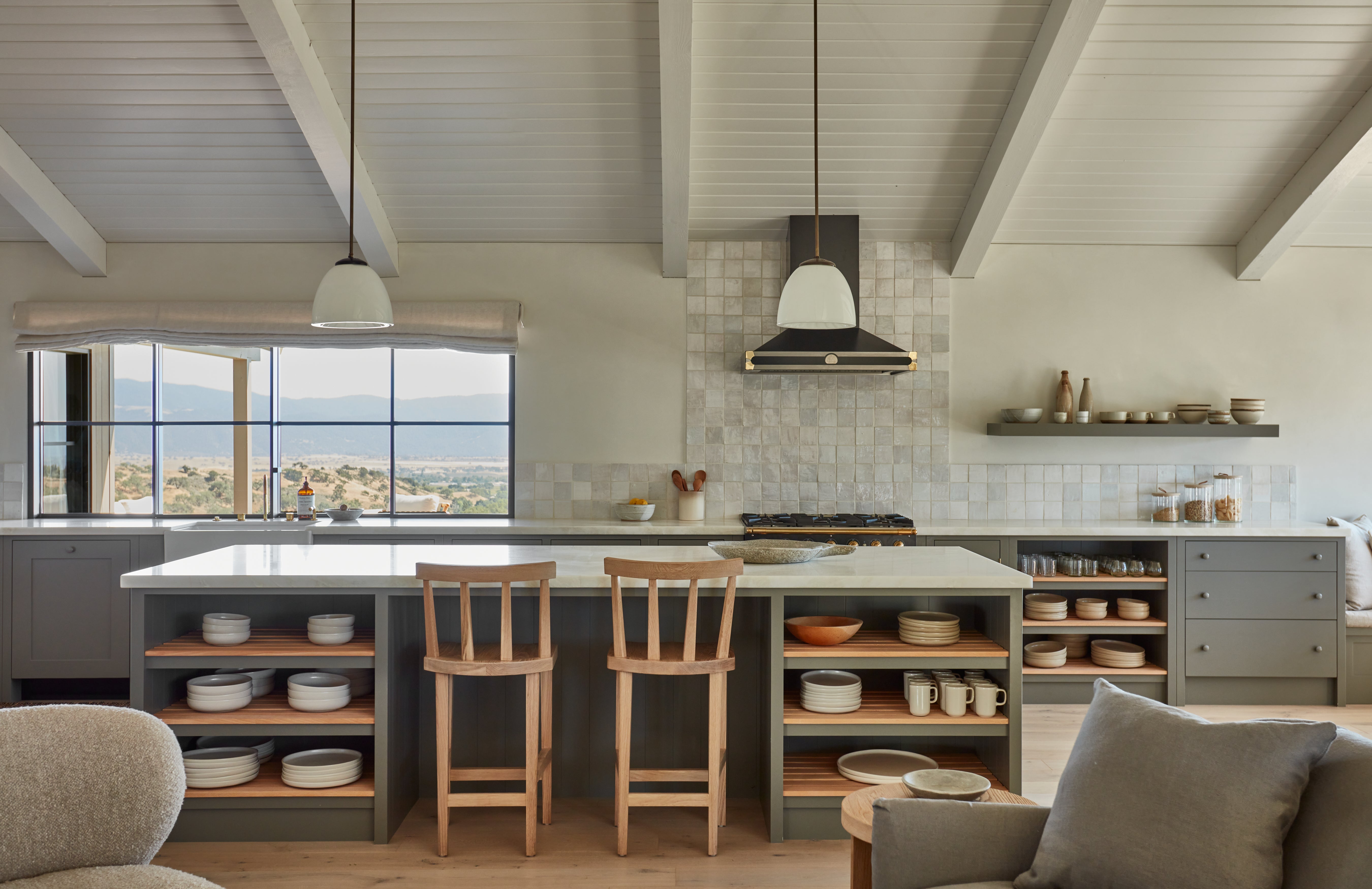
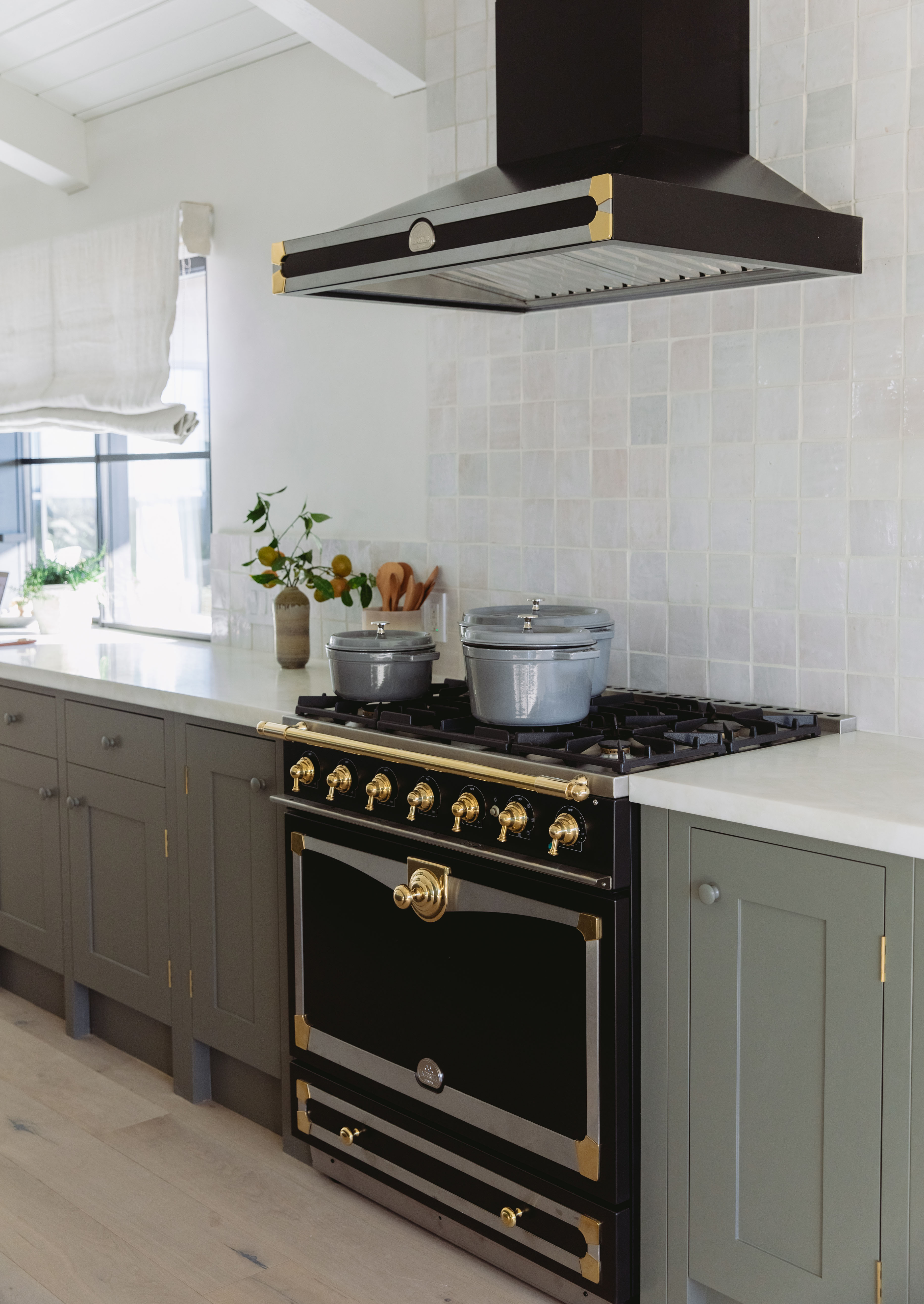
that’s why we loved to see our handcrafted tile weathered white zellige (4×4, 2×6), natural zellige (4×4), new california willow + yarrow, and belgian reproduction hexagons featured in jk ranch. the ranch is jenni’s most recent project in california’s santa ynez valley, a multi-year gut renovation of a classic light-filled california property that showcases jenni kayne home and lifestyle vision.
exploring the ranch, you’ll see clé tile everywhere from the kitchen to the master suite and secondary baths, and from the laundry room to the entry hall.
in other words, all throughout the house. and it’s no surprise: jk ranch’s easy-going feel and authentic, artisan character really does start with the tile.

photo: amanda + scott sanford

photo: michael clifford photography

photo: amanda + scott sanford
we also appreciate the way jenni kayne celebrates creative women, from artists to designers to editors, so we were excited when the jk team reached out to interview clé founder deborah osburn for her take on home, design, and of course, the way in which tile pulls it all together—and elevates it.
deborah sums up her approach to the jk ranch, and all tile design, here.
on designing with surfaces
when we design floor tiles, we do so from the lens of a more european architectural approach…as surfaces that can span from entry into the living area and beyond. the idea of switching it up can mean having your public spaces be one tile selection (which adds continuity and expanse to the feel of that space) but as the space transitions into different rooms, the tile selections can change in each room to whatever vibe you would want that room to reflect. by designing in this way, there is so much more intrigue and texture that is added to your project.

photo: amanda + scott sanford
on where to start in thinking about tile
history should be the starting point for any design direction. it doesn’t mean this history can’t take on some new design direction. that’s actually where the artistry can begin. for instance, my recent home was built in the 70’s and has some intense influences. but i’m guiding that vibe into a more italian version of this era rather than the california 70’s influences it came from.
and the great thing about tile selection is that tiles are what i consider a “foundational” surface. by that, i mean that although tiles are a surface cladding, they are very much part of the foundation of the finishes (unlike wallpaper, for instance), so they have a greater influence on the design process. and this is both fun—but also significant—because you can easily add to these new design directions of a space’s history.

photo: michael clifford photography

photo: amanda + scott sanford
on how to choose your tile
i once got advice from another tile designer who said to stick to the classics. at clé we say: choose the tiles you love, even if you think they might be a passing trend. you are selecting tiles that you have a passion for and by doing so, you’re picking your own classics. this speaks volumes in your home, much more than sticking to tile selections you think will be safe.